
2034 E. 25th Street
This is the only Catucci mark I’ve found that includes the address of the firm. The building there still stands with the company name visible on it. Unfortunately this mark doesn’t have a date.
2034 E. 25th Street
This is the only Catucci mark I’ve found that includes the address of the firm. The building there still stands with the company name visible on it. Unfortunately this mark doesn’t have a date.

2172 E. 24th Street
Now I have dated marks from Carl Petersen for all years of the 1930s.
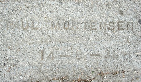
2524 Wakefield Avenue
This is my first example of Paul Mortensen using a straight text mark, rather than the curved text with the curlicue. I also have an example of that style from this year, suggesting that he adopted it during 1928.

2548 Wakefield Avenue
Pink concrete appears to have been a brief fad in the early 1920s. I usually don’t see it with dates, though. This gives me a range of dates for G. Musso from 1922 to 1940.

E. 24th Street at 19th Avenue

2018 E. 24th Street


