2100 block 21st Avenue
2100 block 21st Avenue
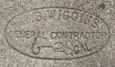
2524 Wakefield Avenue
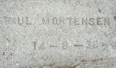
This is my first example of Paul Mortensen using a straight text mark, rather than the curved text with the curlicue. I also have an example of that style from this year, suggesting that he adopted it during 1928.

2100 E. 29th Street
This one makes me happy in a confused way, pushing this version of the Fitzmaurice mark (version III) back three years. As far as I can tell, this was used entirely within the period that version II was used.
2200 E. 29th Street
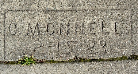
This variant of G. McConnell’s mark shows that he produced it one letter at a time.
2215 E. 29th Street
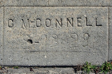
George McConnell did this whole block. It wasn’t until I saw this mark that I realized what the little dash after the “M” meant.
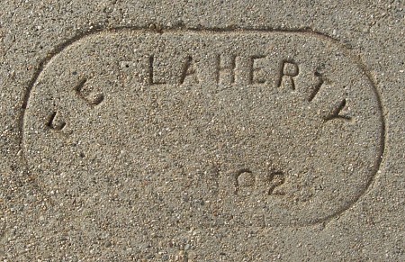
1424 Hampel Street
A new first date for Mr. Flaherty.
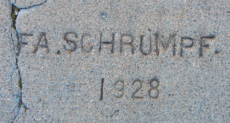
1784 Excelsior Avenue
And here is the mark of Frederick Schrumpf, right across the street from the Altenheim complex.
