2524 Wakefield Avenue
This is my first example of Paul Mortensen using a straight text mark, rather than the curved text with the curlicue. I also have an example of that style from this year, suggesting that he adopted it during 1928.
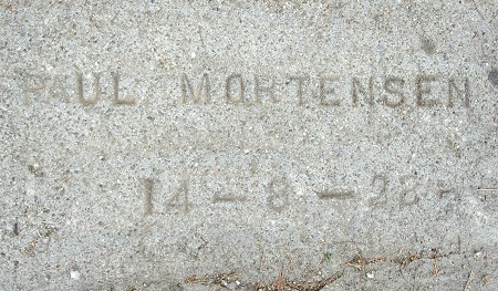
2524 Wakefield Avenue
This is my first example of Paul Mortensen using a straight text mark, rather than the curved text with the curlicue. I also have an example of that style from this year, suggesting that he adopted it during 1928.

Leave a comment